Redesigning the homepage for enabling compelling storytelling to drive user engagement.
Backcountry
Backcountry is a premium e-commerce outdoor retailer with the mission of connecting people to their passions. At Backcountry you’ll find the highest-performing outdoor gear as well as clothing and expert level gear knowledge. Camping, trail running, mountain biking, skiing, mountaineering, backpacking and more—all under one roof.
Challenge
Design a series of components and a base page layout for the Backcountry homepage that are easy to “plug and play” in the day to day and highly customizable by the marketing teams to produce visually compelling stories without the intervention of the engineering team.
Background
Backcountry owns and operates 4 websites hosted on separate UI platforms, Backcountry, Motosport, Steep & Cheap, and Competitive Cyclist. The homepage redesign fell under a larger UI migration project to move all sites on to a unified UI platform with unique design systems applied. Backcountry sites also operate on homegrown Content Management systems that are hard to maintain and harder to update. The business decided to onboard Adobe Experience Manage as a new CMS and Digital Asset Manager to replace the homegrown tools. The current homepage component configurations were set in the codebase and gave marketing and creative teams little freedom in how the content is displayed and how much.
Role
I was the dedicated UX designer on the CMS migration project. I conducted the research, designed the UI, and conducted usability testing before launch.
Research
When thinking about the homepage of any website it serves as basecamp, bulletin board, and a place discovery for our users. For the brand, it’s a place to tell their story and really showcase who they are to new and old customers.
This project was a full end to end experience overhaul for both business users and end consumers. My team was designing & building both how components show up for end users and how the marketing teams input and control the display on site. More importantly, we had to design usable, accessible components for our users and provide a recommended standard homepage design to guide our marketing team.
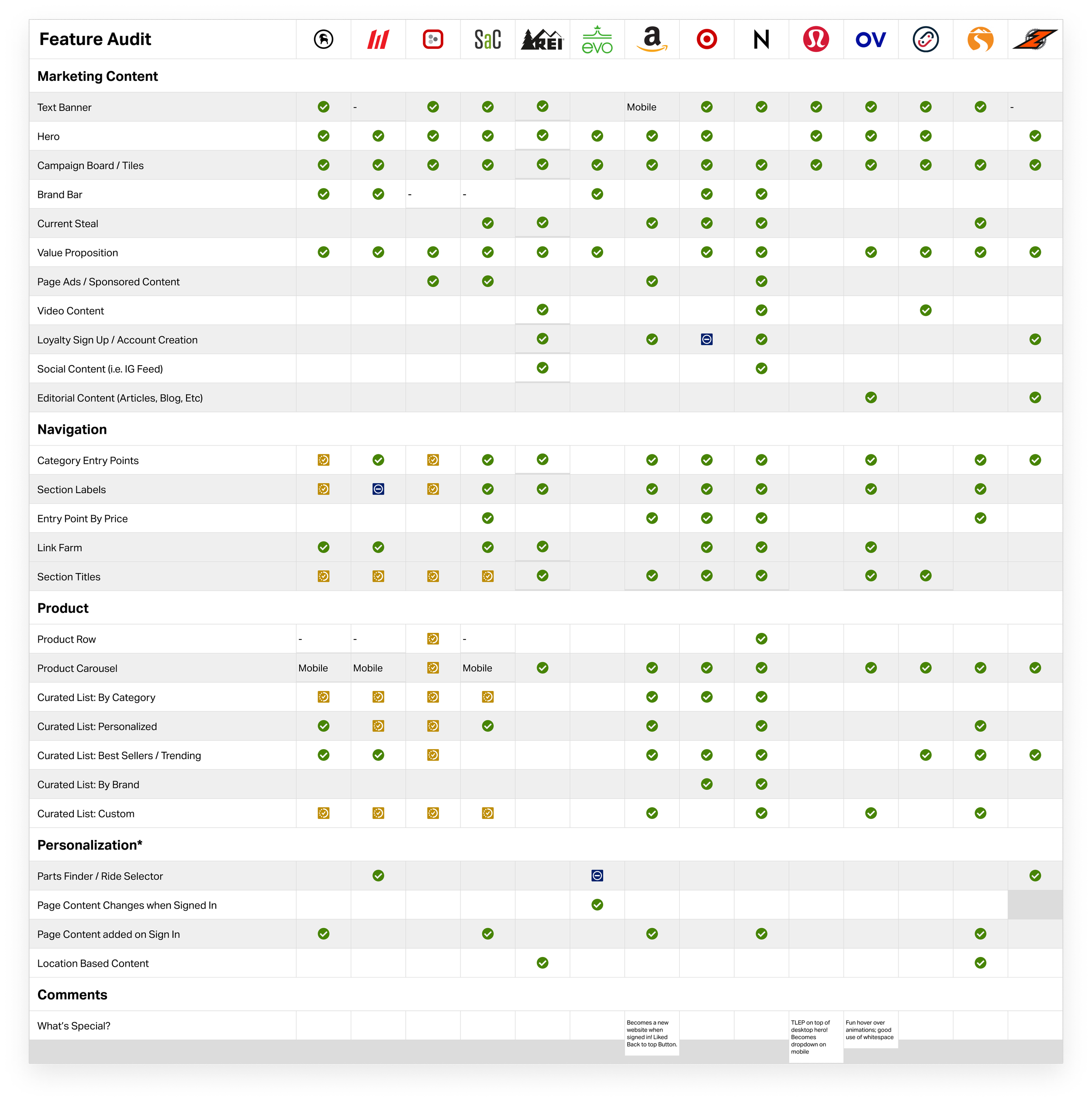
Due to the massive scale of the project, I leaned on Baymard Institute’s best practices for homepage components to guide the designs as well as an audit of the competitive landscape. I used Mouseflow to watch user sessions and heatmaps / clickmaps to understand how our users were currently engaging on the homepage. Through this body of research, I found the old homepage had experience gaps including missing entry points for Gender/Categories, a lack of way-finding making campaigns to feel random, hero carousel slides receiving low engagement and are declining in popularity across ecom, among other discoveries.
Design
How can we design a system that scales and grows with all 4 websites? How do you design a page meant to inspire & introduce yourself to new users and help returning users navigate through new content and keep them engaged? How can we give the production teams creative freedom while presenting our customers with the best user experience?
At the end of the MVP stage of project we created a small library of components that included a Home Hero, Campaign Card, Images, Plain Text, Carousels, and Product Components. The components were built so they could be reused for different purposes - the Campaign Card could both be a curated marketing campaign or display as a grid of categories.
The component set and page design was tested in mobile and desktop usability sessions, and applied those learnings to our final recommendation. We learned users thought the new design was fun and easy to navigate, they tended to use category entry points when exposed to them, and they were willing to scroll through carousels for guided shopping experiences but frustrated when things like customer service were hidden within a carousel. The final page included an easy to use Hero, improved entry points to categories/gender, improved wayfinding (section headers for easier browsing, clear CTAs on campaigns), removal of the hero carousel experience, a shift in product recommendation strategy to encompass a broader product assortment, demonstrated our brand value and editorial voice as an industry leader.
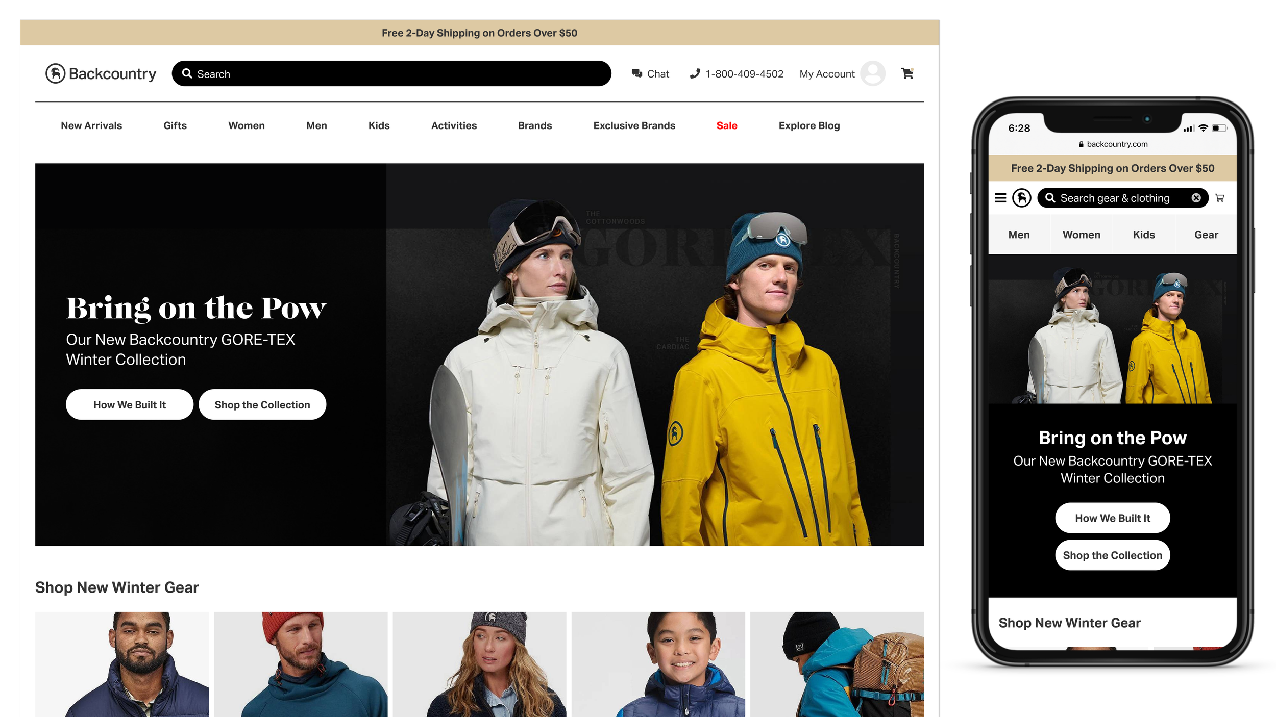
The final homepage design - fully customizable and configurable by our creative teams and designed for ease of use by our customers.
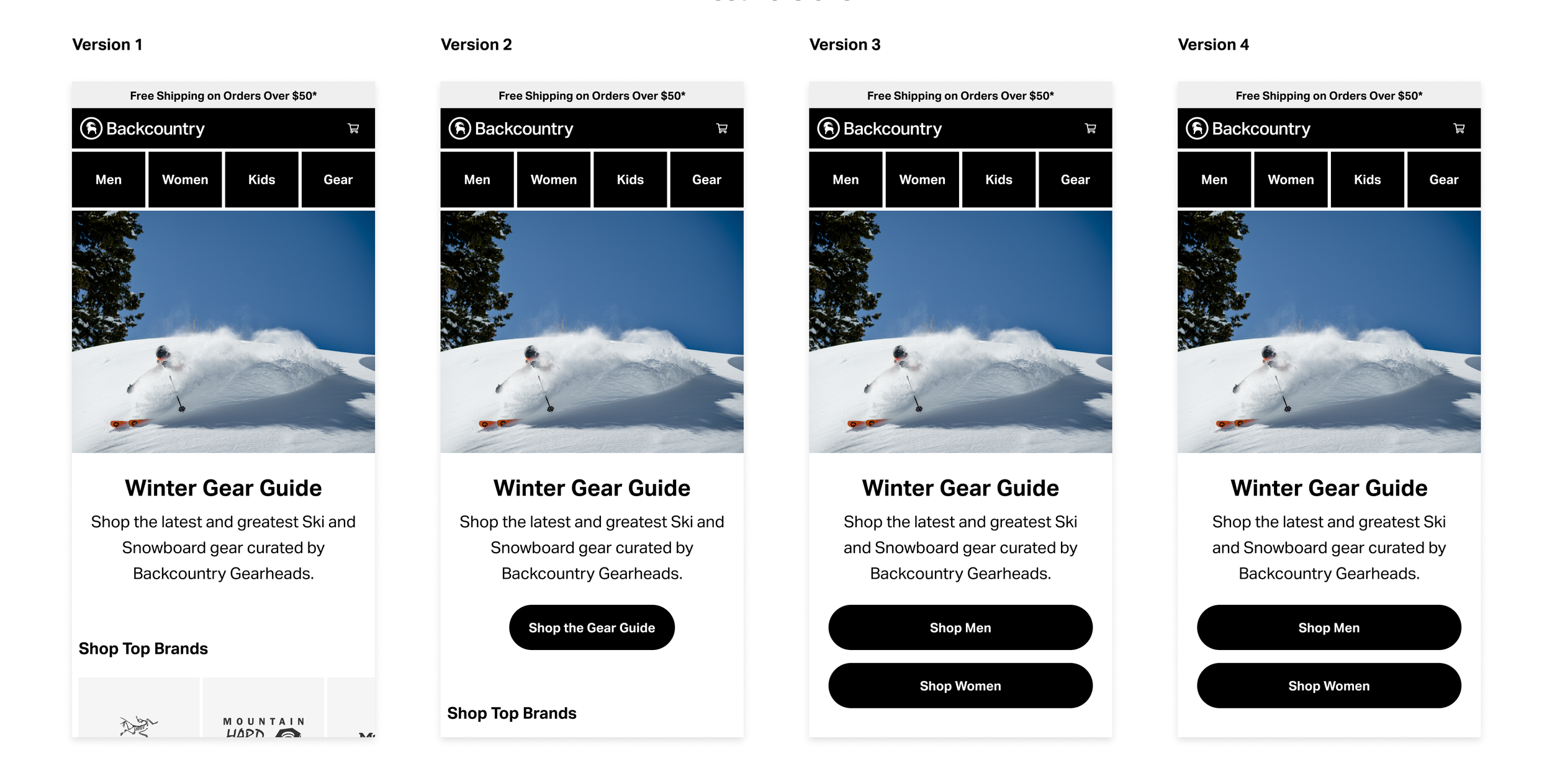
Mobile Homepage concepts tested in Usability Tests. This view shows initial page load of the homepage on mobile - we ended up going with Version 2 for the Hero component.
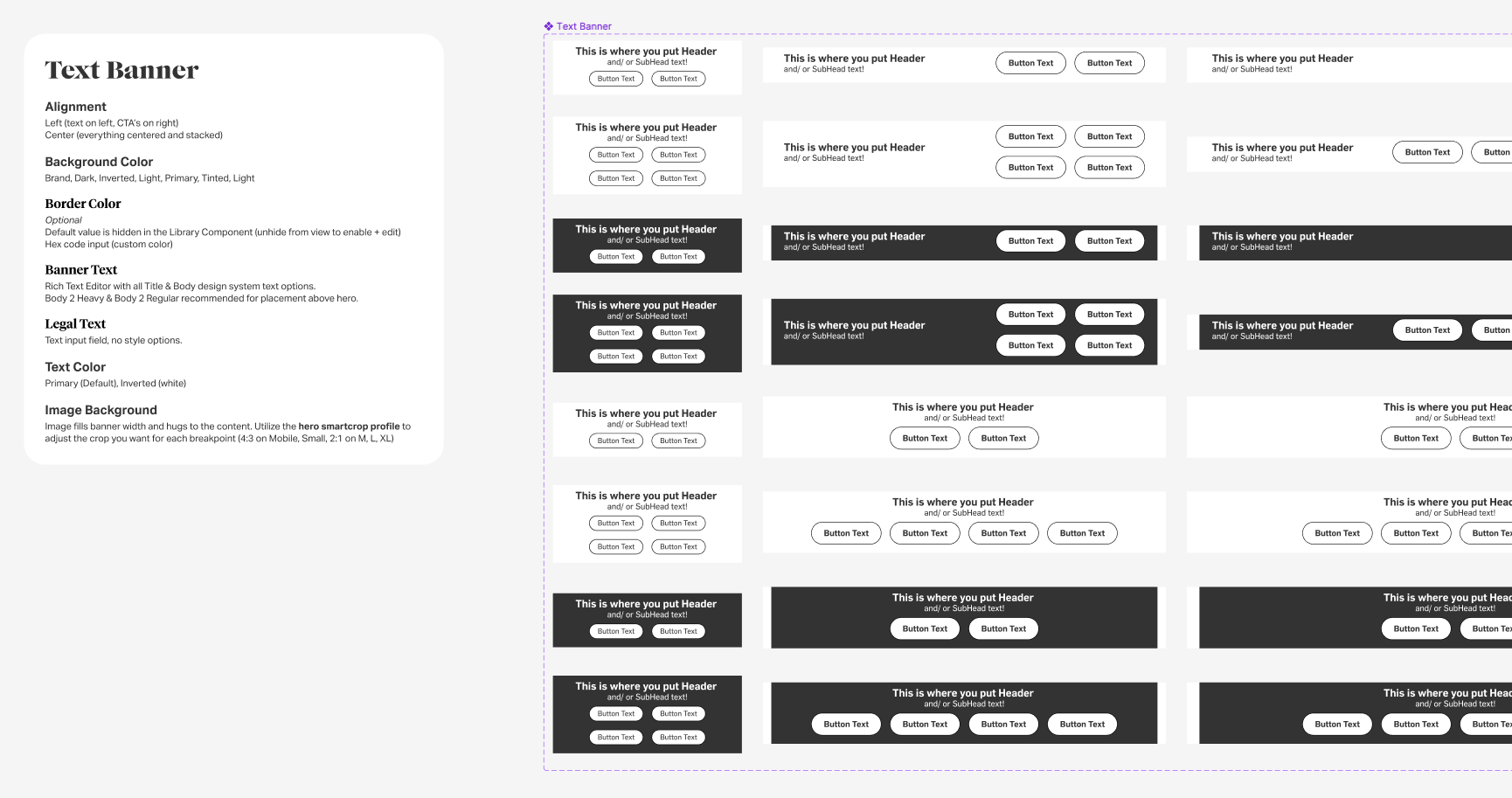
Figma Component Library - Component Example. The Text Banner was developed after the initial MVP launch and demonstrates the complexity and configurability of the library developed.
Deliverables
Usability Testing Read Out
Comparative Audit
Product Review Presentations for Executive Leadership Team
Full Page Designs & Standard Layouts for all 4 brands
SOP development & documentation for Technical Production Team
Figma Component Library & SOP Documentation for Creative Teams
Results
More intuitive component designs: 80% increase in click thru rate on homepage hero component (8% CTR -> 18% CTR)
Increased amount of & diversification of content on the homepage
Increased autonomy of Creative & Marketing teams to manage homepage content
Increased publishing flexibility for Technical Production teams and reduced hours worked outside of standard office hours (team members are now able to schedule content ahead of time where they previously had to push changes live in real time)
Reflections + NExt Steps
After a successful launch to Backcountry, I managed the creative and engineering teams to launch the changes on Steep and Cheap and Competitive Cyclist. The success of the launch was not solely the new technology platform, but the hours of onboarding, training, and support hours I spent with the teams utilizing AEM. I hosted weekly office hours for the creative team to teach them the constraints and flexibility of the AEM component set. I created a new framework for the cross functional business teams to plan marketing content with in a much more fluid homepage structure. I introduced new ways the team could utilize the tool to create new pages - like Ski + Snowboard Guides during our peak season. We continued to build on the CMS’s features and functionality in the year following, including introducing new components, new page templates, and better mobile + responsive layout options with the end goal of migrating all content management to AEM.