
Isella Outdoor
Bootcamp Project: Mobile Web Design for an online consignment shop
School Project
Team: Emily Engstrom, Joey Eddington, Myself.
Role: Project Manager + UX/UI Designer
Tools: Notion.so, Figma, Miro, Zoom, Google Drive, Slack

Introduction
Isella Outdoor is an online used gear shop that started on Instagram and grew into a fully fledged online consignment shop. Growth was driven by their mission to “end toxic gear culture”, or the idea that you have to buy brand new expensive gear to get outside. Isella provides scholarships to minority groups that typically lack access to the outdoors or funds to buy gear.
Overview
Problem
Their Message is Unclear Isella Outdoor’s mission, their most compelling advantage, is buried in multiple pages and lengthy bodies of text making it hard for users to easily grasp.
Selling is Difficult Isella Outdoor has a complex process to list gear on their site that volunteers manually import from google forms.
Navigation is Confusing Isella Outdoor’s menu navigation is unclear and poorly organized.
Solution
Our solution was to change the information hierarchy so the messaging is clear and the navigation makes sense. We also felt that the listing process was far more complicated than it needed to be and could be simpler for the sellers and Isella’s volunteers.
User Research
Interviews
We conducted a 4 user interviews with women who fall in to Isella’s target demographic. We wanted to find out what their motivations are for buying and selling used gear, what they look for when shopping, and what makes a great experience selling gear online. We knew the listing process needed updates but wanted to make sure the end product, a listing on the website, would serve both buyers and sellers.

We were able to draw three main user insights from our interviews:
Our users care about having a positive impact on the world both through sustainability and making the outdoors more accessible for everyone. They believe people enjoying nature, means more people will care about saving our planet.
Fit and Feel of a product are incredibly important when shopping, and often they opt to shop in person when possible.
A mobile friendly site is important to users both to buy and sell items. Selling especially because they must upload photos they take on their phones.
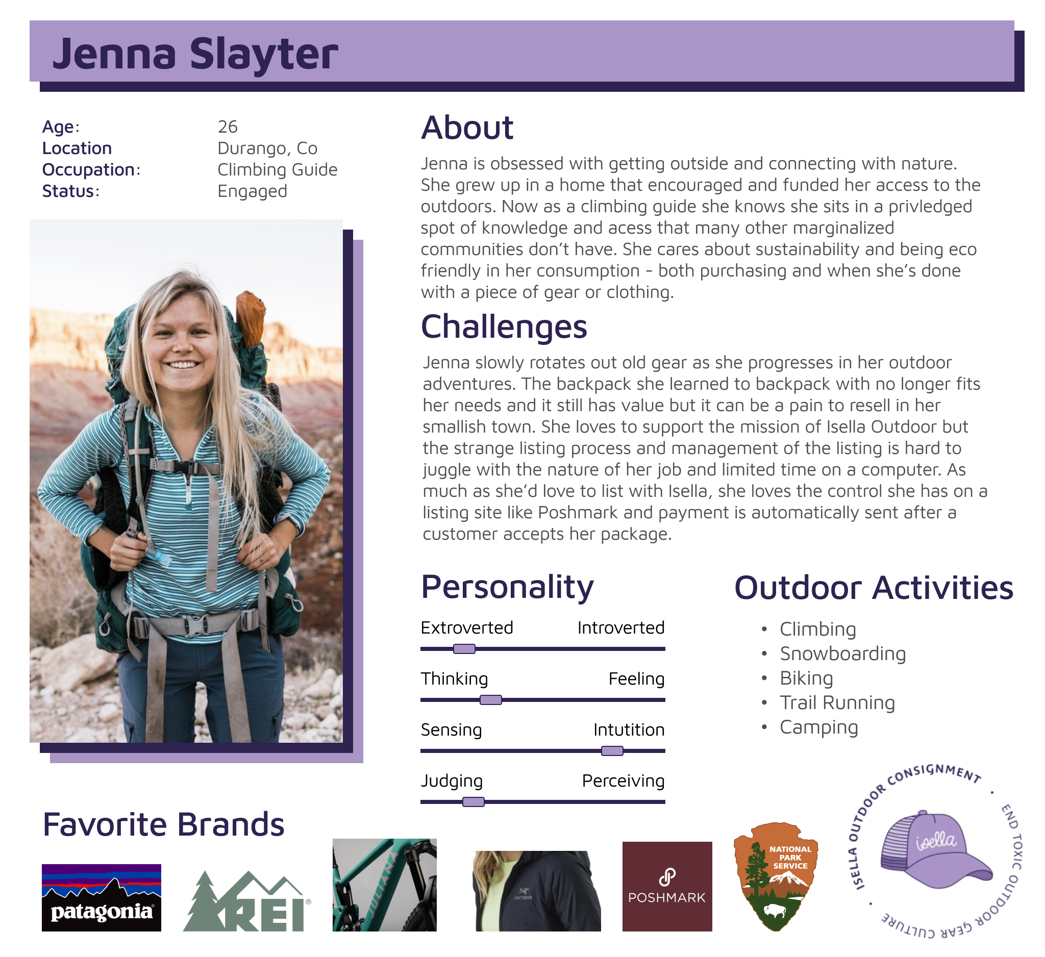
Based on our User Interviews, we developed our User Persona: Jenna Slayter.
Survey
We know our target market is on Instagram, because Isella gets many sales by using the platform to advertise goods. We connected with Abbi Hearne, a photographer with a strong following of users like Jenna. She agreed to post a link to a survey we created in Google Forms. Our main questions in the survey centered around what Jenna needs, wants, and loves about shopping online.
337 participants responded.
Their responses gave us insights on our two main user groups: Buyers and Sellers.

For Buyers, Isella prompts great item descriptions and fit but has room for improvement on their Ease of Use.

For Sellers, Isella makes shipping easy with their USPS shipping labels and cuts out the back and forth between buyers and sellers. They have much room for improvement on the process of listing gear on their website.
Competitive Analysis
After hearing feedback from so many of our survey respondents about the websites they use, we did some research on what the posting process looks like on other websites. This is what we found:
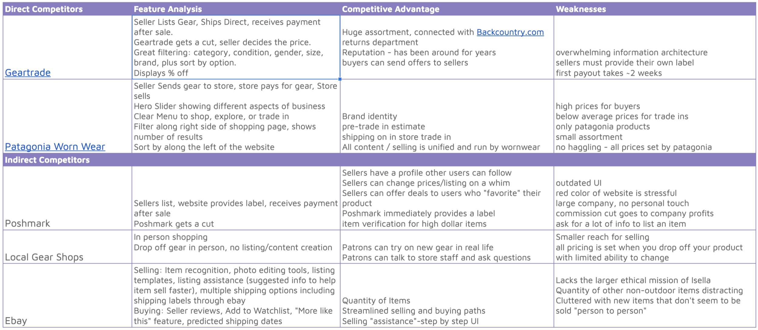
Some features we found really valuable from this analysis. We found one of the biggest competitive advantages of these businesses are reputation and recognition. Sites like Poshmark and Ebay have robust listing processes we could mimic. And looking at Local Gear shops, Isella is almost a bridge between these extensive online resell websites and the feel of a mom-and-pop shop. We also liked the auto-calculation of take home pay we added in the second iteration of our design.
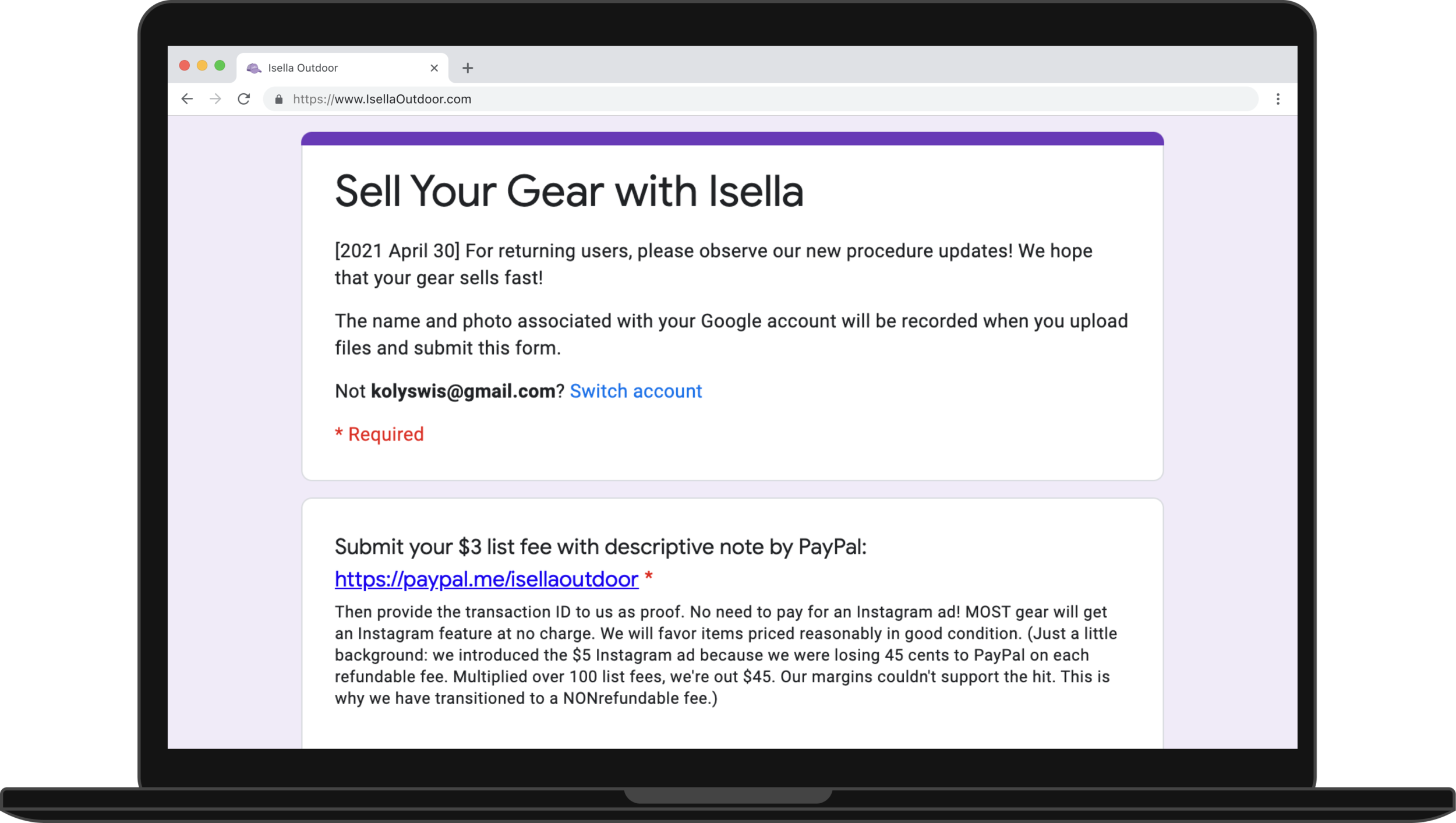
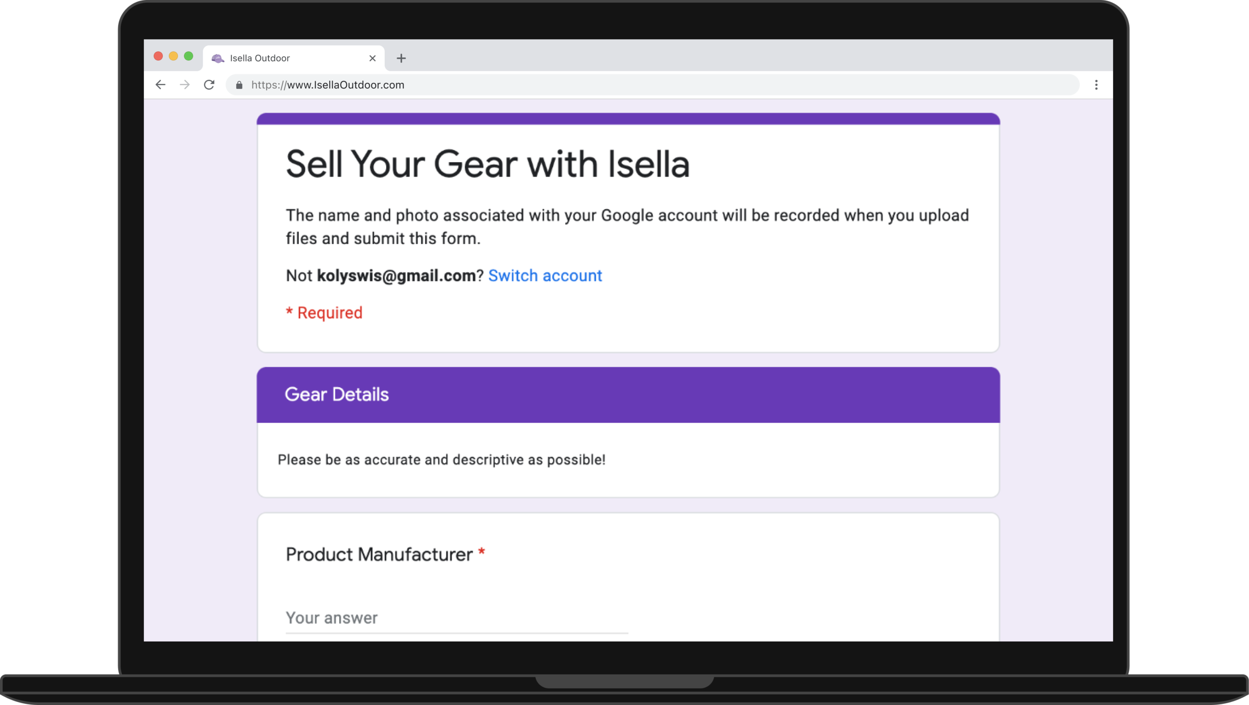
Listing Process Analysis
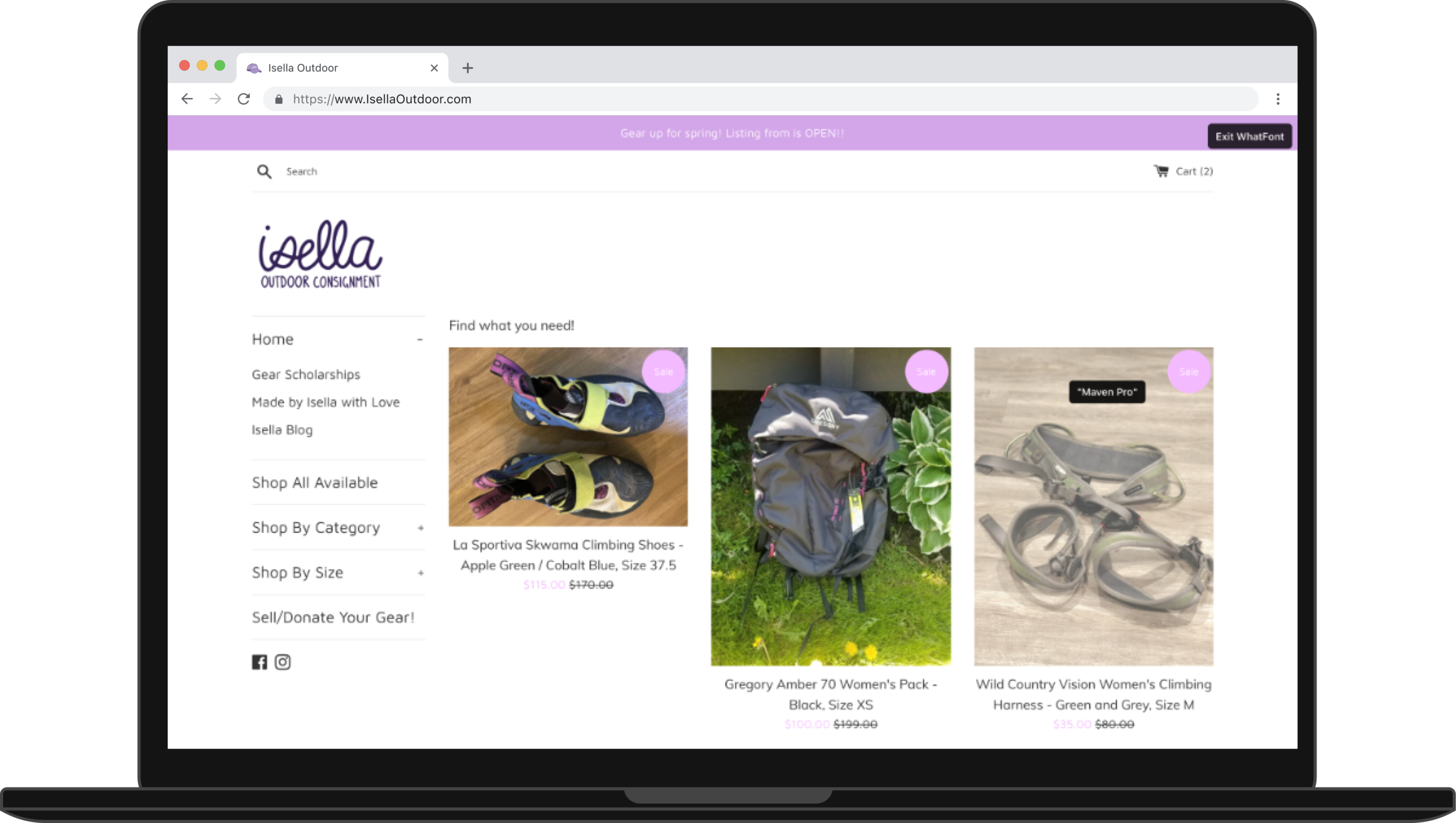
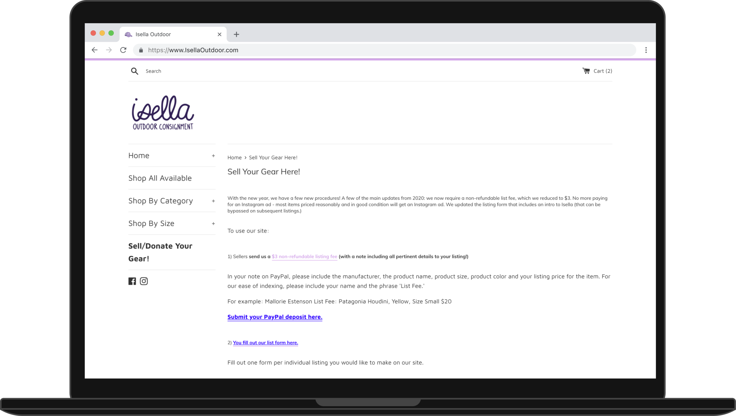
This is a seller’s current experience uploading a listing to Isella’s website. Behind the scenes at Isella, the process isn’t any easier. They have a team of volunteers that manually uploads the google form submissions with images in a google drive to the website. The turnaround time on the process is about a week as they have a “gear drop” every Friday with new listings.

Click through the slides for the current experience:
Define
Based on all of our research, we landed on three problems to solve with our design:
Isella’s message is not prominent on the website.
Isella’s listing process is complex and painful.
Isella’s navigation is confusing.
User Flow
We developed our first user flows for selling with this in mind. Buyers mentioned in our survey they liked being able to ask sellers their questions directly. After looking at the new user flows and our time constraints, we agreed it would be a great feature but is out of scope for our project. The new listing process and account on the site would just be for sellers for this project. .

User flow with a “social” element.

User flow for just listings.
Design
Sketches
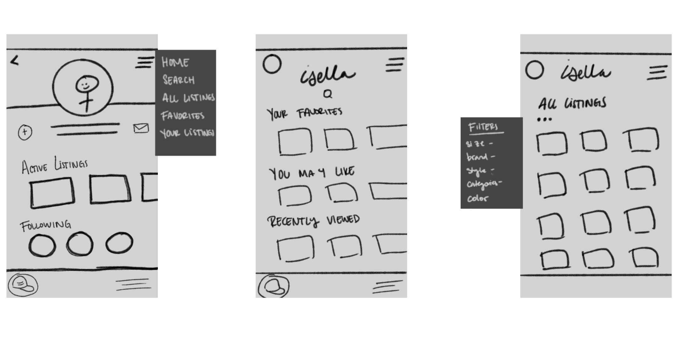
Sketches with a Social Profile

Sketches for a new listing + menu
Low Fidelity Designs

Mobile Wireframes

Desktop Low Fidelity Homepage
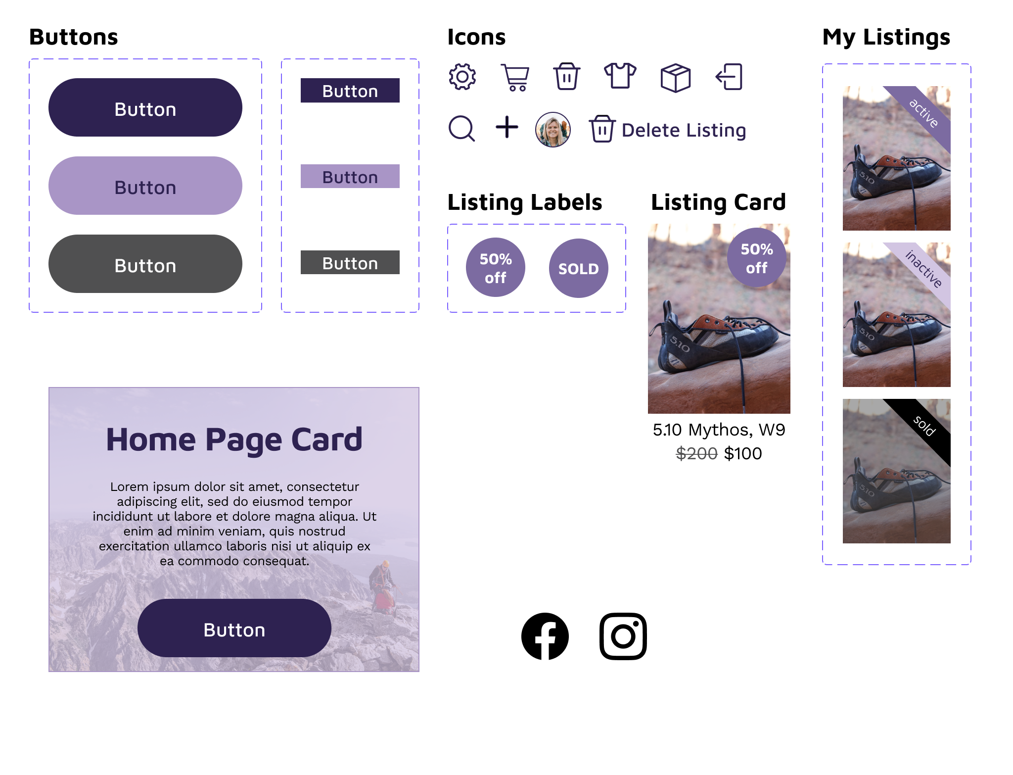
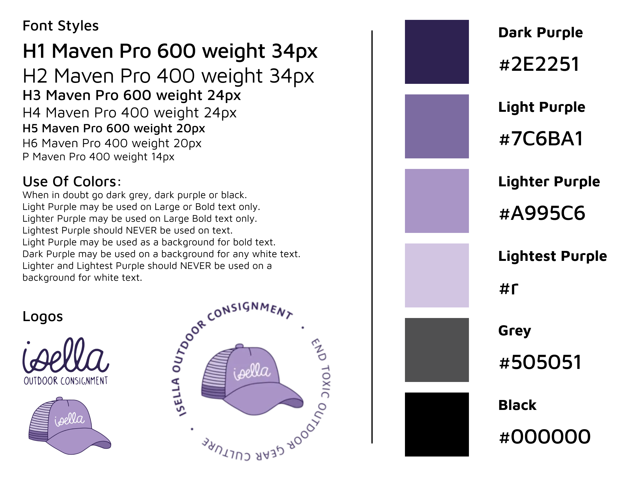
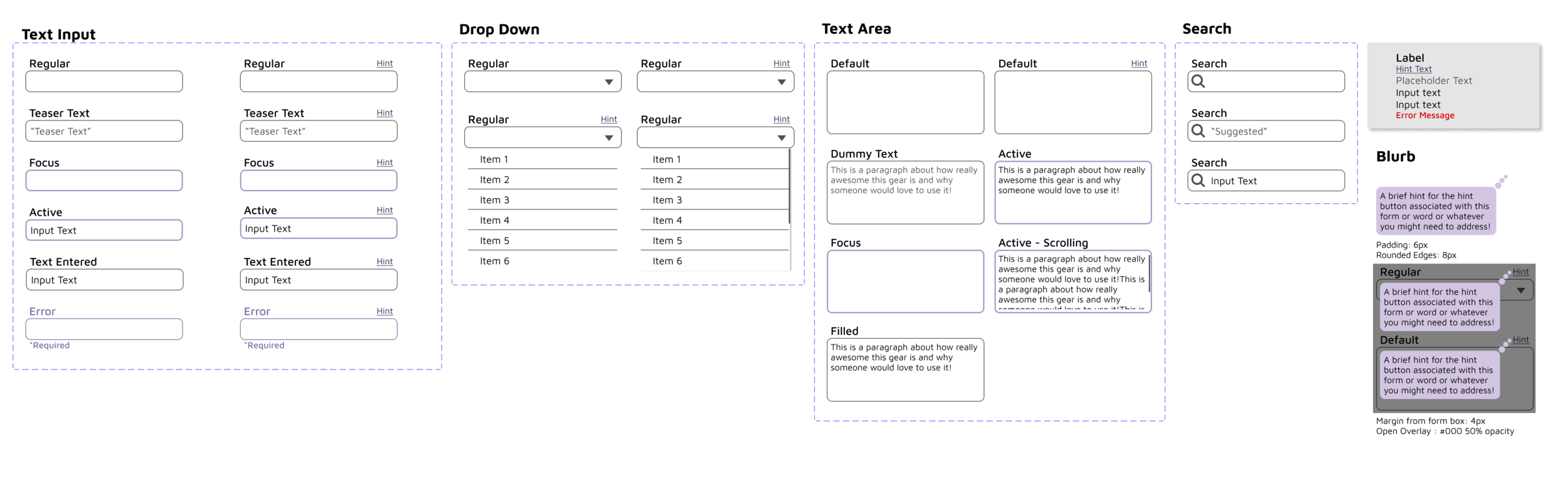
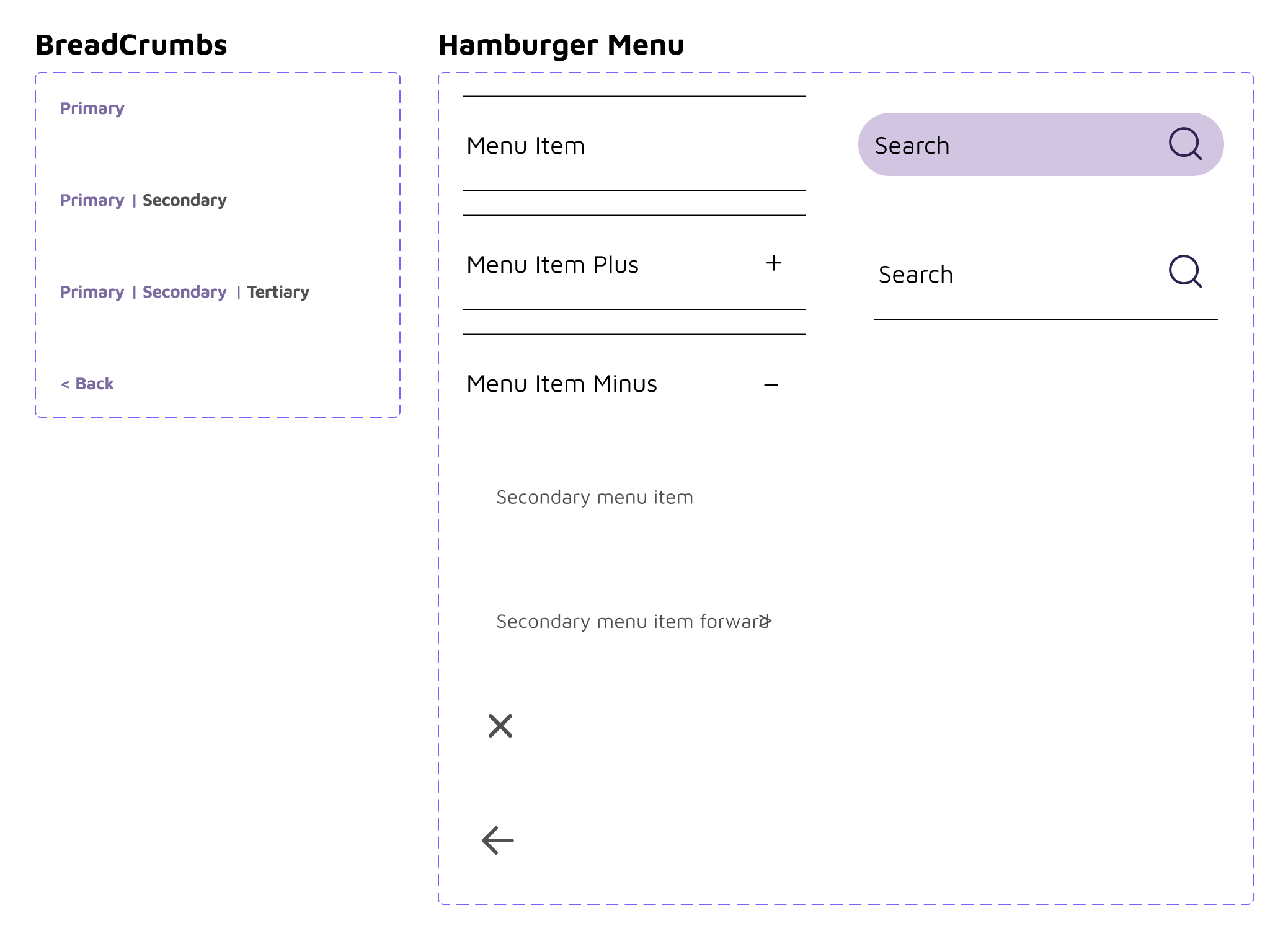
Style Guide
We created a style guide for our design before redesigning what we learned in testing. In it’s current state, Isella Outdoor’s website runs colors close but not quite matching their logo in a light, bright color scheme that also isn’t quite accessible. In our redesign, we took our colors straight from the logo with clear guidelines on how to utilize them for accessibility. We didn’t reinvent the wheel with our redesign, we just updated the styling to be modern, consistent, and accessible.
Iteration based on testing
Messaging: From our sketches to our high fidelity prototype, we made Isella’s mission the first thing you interact with on the site. In our user testing it did not inhibit our users from finding listings to shop or how to navigate to find gear. In our next round of user testing, we would like to do A/B testing on finding Isella’s mission starting on the homepage versus shopping pages similar to the website’s current state.

Sketch, LoFi, and HiFi homepage design.

HiFi Desktop Design
Listing Process: At first, to reduce visual clutter and scrolling, we created a three screen wireframe for the listing process. We thought that having the separation would simplify and streamline the process for users.

After our user testing, users told us the opposite. Having a scrolling screen with everything on a single page was more natural for users and it would more easily translate to an edit screen after a listing had been submitted.

Navigation: The site’s only navigation bar was included in with the product sorting options. On mobile the formatting of the truncated menu takes up a good 1/3 of screen space. Changing the home page to display all the site has to offer has allowed for navigation that is differentiated from the product sorting.

The left, grey phone is Isella’s current website navigation. To the right, grey phones are our teams’ redesign.
Future Iterations
Further user testing, specifically how users perceive the homepage, retesting the changes we made based on our lofi testing, and the new high fidelity UI elements. It would also be valuable to do some A/B testing of the current site homepage and the new homepage to make sure we made the message stick in a meaningful way to our users.
Designing for Desktop and Tablet, given the time constraints we focused on fully fleshing out the mobile listing process and going forward we can bring that design up to larger screens.
Meeting with Stakeholders, it’s climbing season and our stakeholders are on Denali. When the team returns, we plan to present our findings, gather their feedback, and hammer out technical requirements for our next iteration. Not having a connection with the stakeholders to know their priorities was difficult and we did a bit of inferring based on conversations our designers previously had with the Isella team about a potential website redesign.