
Ski utah mobile app
Role: UX Designer, Individual Project
Tools: Figma, Miro, Zoom, Google Suite
Introduction
Ski Utah is the marketing arm of the Utah Ski & Snowboard Association and runs SkiUtah.com along with the SkiUtah app posting the most up-to-date snow forecast and resort information.
Problem
The COVID-19 ski season presents a unique challenge to resorts and skiers in Utah: prevent disease spread while spreading the stoke of skiing. Resorts are tasked with creating policies to prevent COVID-19 that changed based on CDC recommendations and skiers must arrive at the resort prepared to follow changing resort policies. Currently, each resort has a unique approach and where to find a resort policy online varies.
Solution:
Develop a feature in our app that gives Utah Skiers up to date COVID-19 policies consistent across Utah resorts so that they can plan their ski days without the fear of being turned away from the lift.

Research
How are snow sports enthusiasts in Utah planning for ski days during the COVID19 pandemic?
Survey
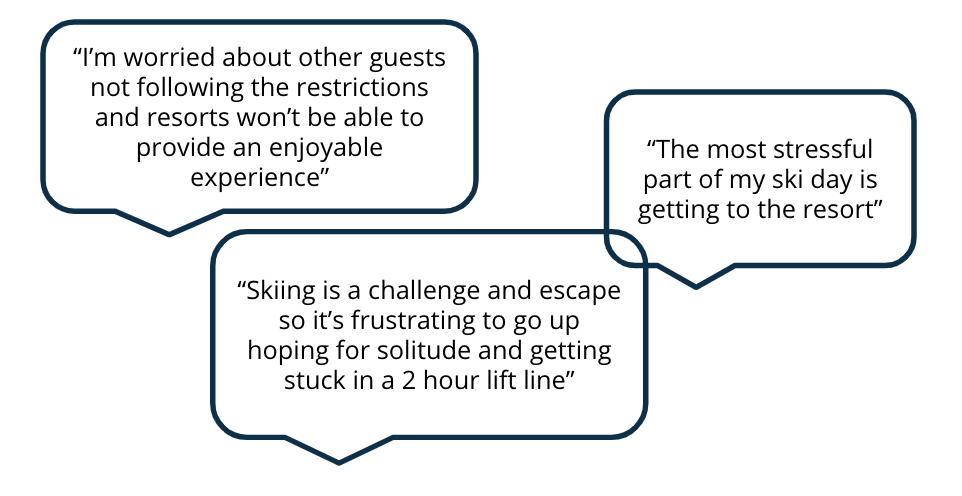
I conducted a survey of key users to understand their primary concerns during the pandemic ski season. From this survey, I learned users are already aware of and planning for resort restrictions. I found users are instead concerned with crowds, traffic, and parking - problems exacerbated the pandemic.
My key insight was that our users know they can control how they show up on the mountain but need to know what conditions they’ll be showing up for.
User Interviews
I contacted my user base to gain insight on their concerns for the pandemic ski season ahead and what technology they use to prepare for a day on the mountain.
Those interviewed expressed they use multiple sources to find information on traffic and parking conditions at the resorts including SkiUtah, OpenSnow, Google Maps, Twitter, and resort websites.
From the overall results of the interviews, I was able to conclude, like our survey results, skiers are most concerned with travel to the resort, parking availability, and crowds on the ski hill. The three concerns compound on one another: if there’s bad traffic, it’ll be hard to find a parking spot, and the lift lines will be long.
Secondary Sources
I took to the books for some supplemental research to validate our users' concerns: Epic Pass sales were up 18% at the end of 2020 and according to the Ski Industry Association there was an overall 30% increase in consumers hoping to hit the slopes this winter.
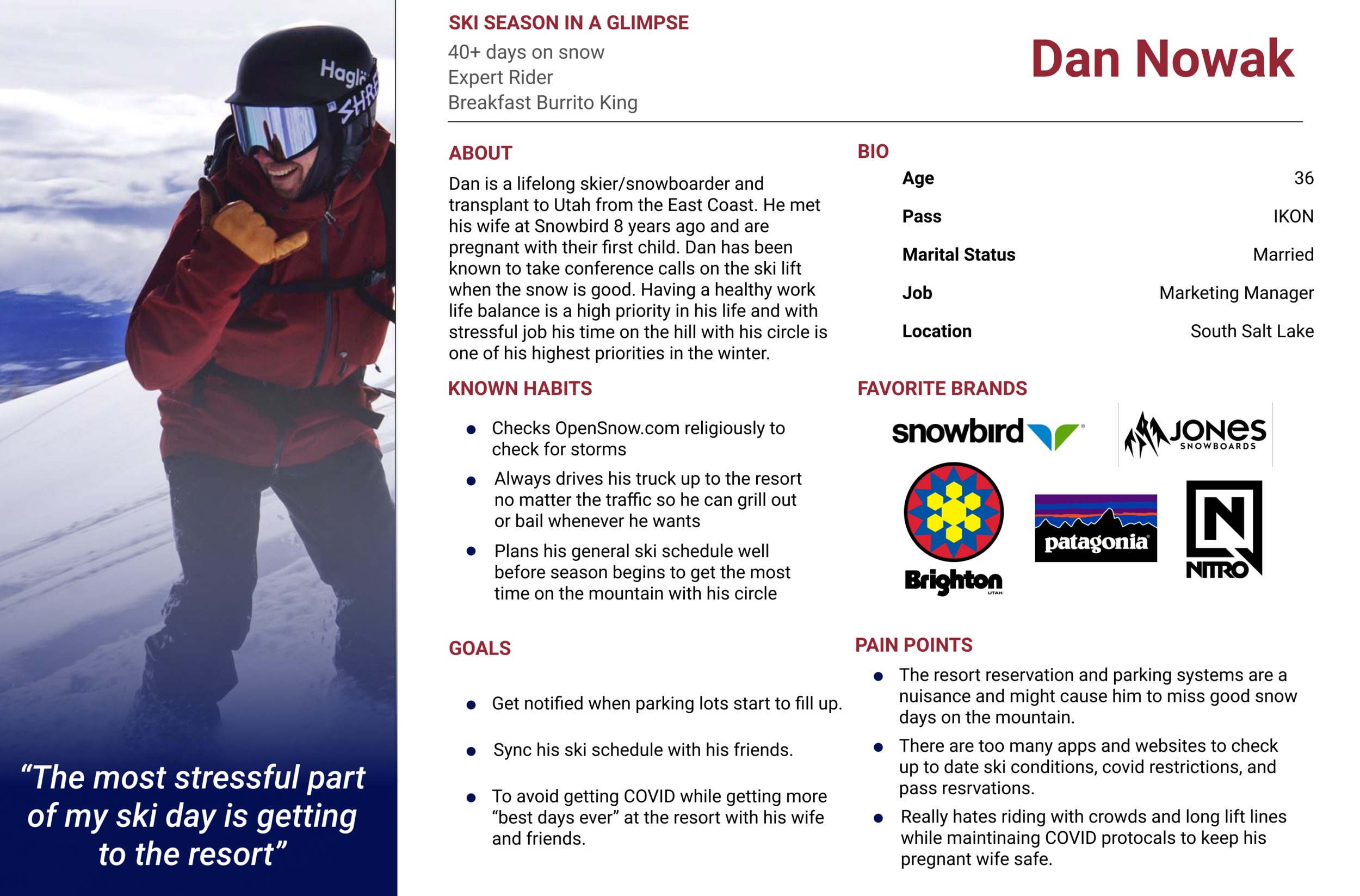
The persona I created resembles the feedback I received from skiers in my research.
Pivot
After interviewing and synthesizing the research, I found skiers are much more concerned about getting stuck in traffic and dealing with crowds then using a specific app to find COVID restrictions at each resort.
Our users know how to mitigate their risk at the ski resort and the factor they cannot control during their ski days is how busy it is.
I decided to pivot my focus to develop features to inform users about the crowds getting to and at the resorts to help inform their pandemic ski days.
These features will remain valuable to skiers after the pandemic, especially as skiing in Utah becomes more popular and the state population continues to climb.
Revised Problem
Skiers in Utah need a singular place to check ski and road conditions so they can plan their travel to the resort because currently skiers must check multiple channels to find information crucial to getting to the resort and having a great ski day during the COVID-19 pandemic.
Design
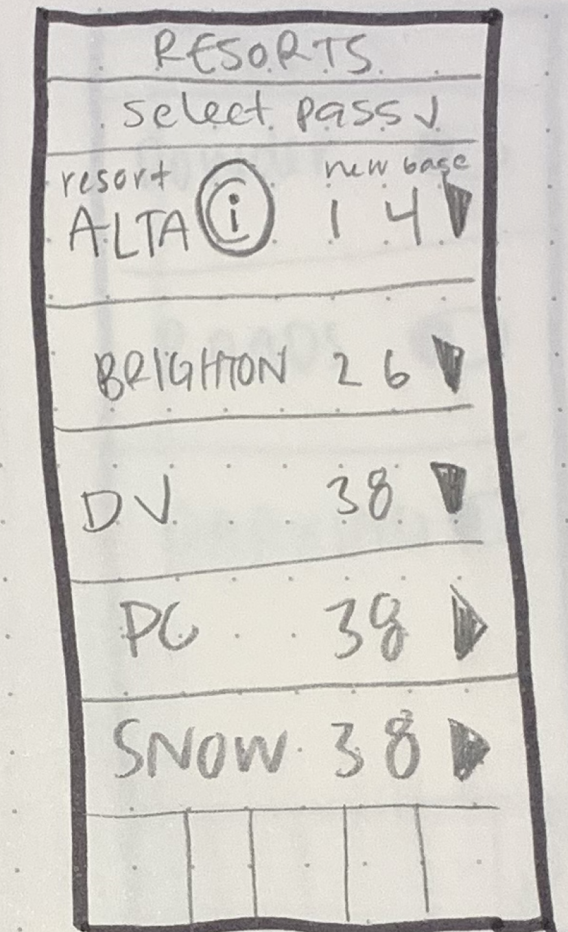
Designing for Dan, I started with a sketch of each frame he will use to check parking conditions and traffic conditions to Alta Ski resort and set an alert. I tested the original user flows via guerilla test and testers noted alerts should live together in one location to be managed instead of being buried within other pages.
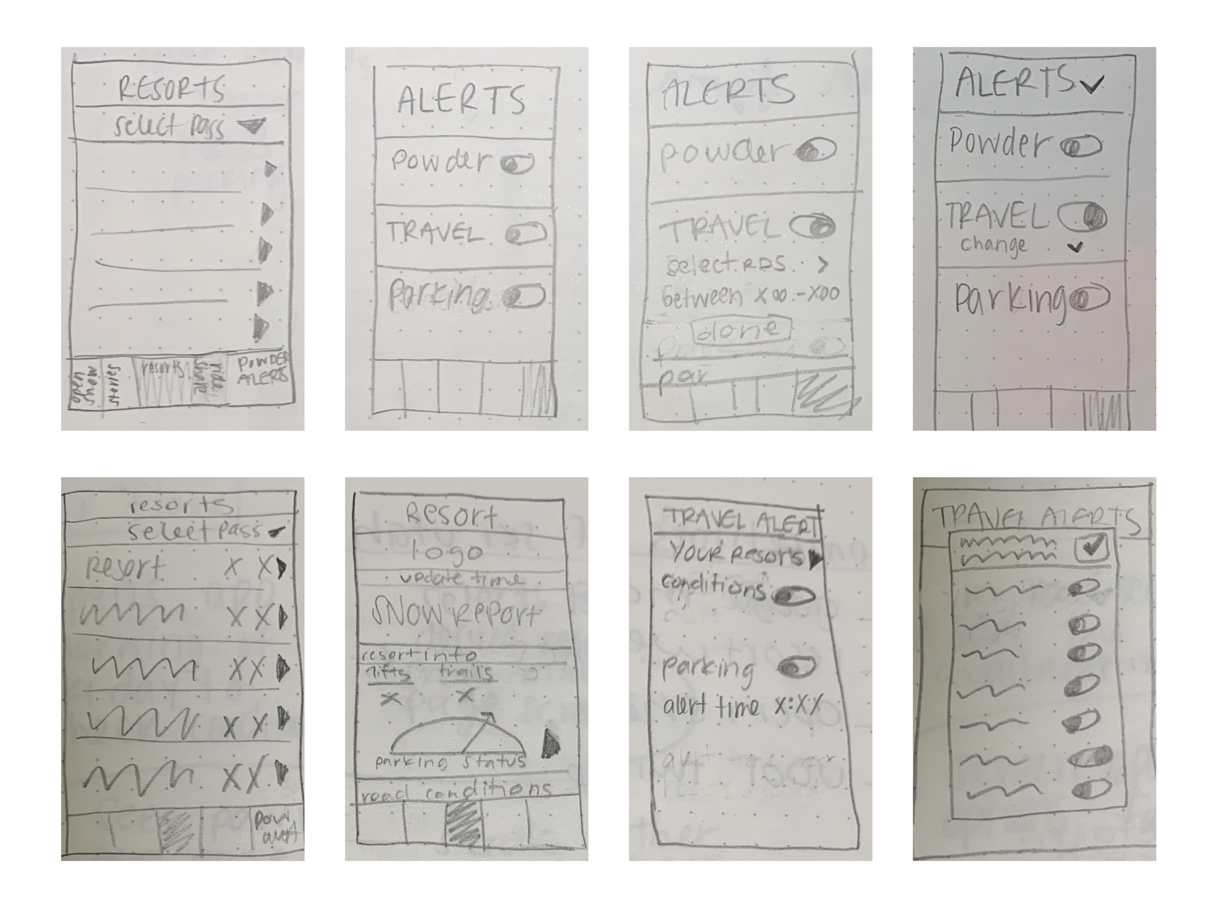
I then brought the design up to mid fidelity in figma and tested a clickable prototype with users to understand how they find information within the app, how easy it is to find and set an alert, and if they understand the information presented. I found users were able to complete all tasks but some took the long way to get there.
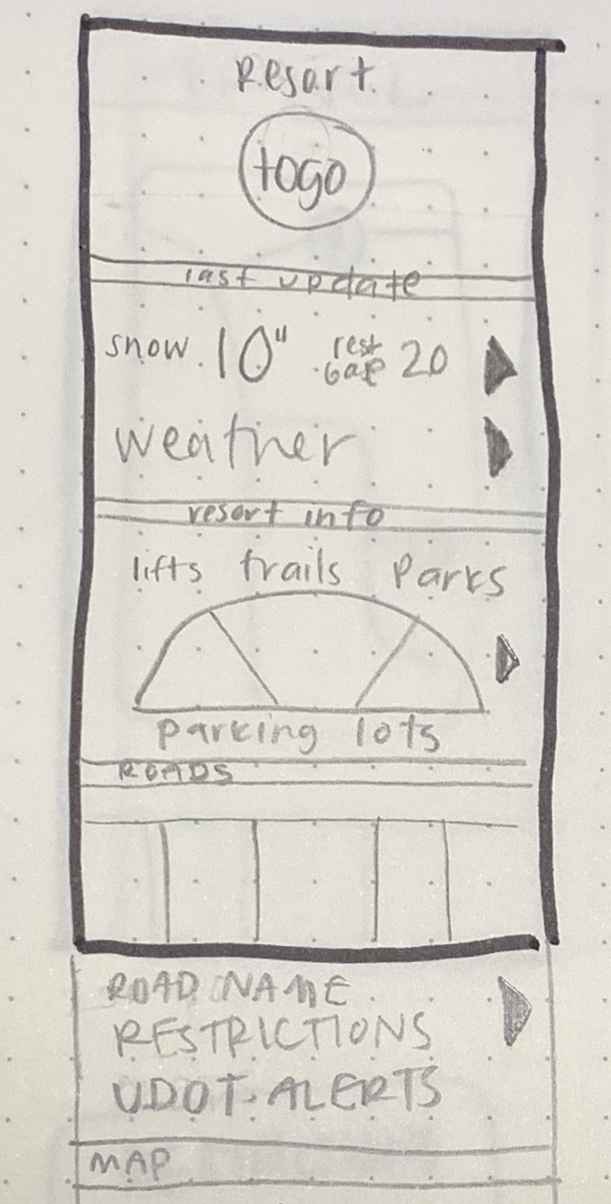
Parking
Testing Found: Most users clicked the parking lot gauge for more info and were confused to be dumped on an alerts page.

Updates: Info text was added to clickable cards on the resort subpage and a parking info subpage added before alerts page link.

Road Conditions:
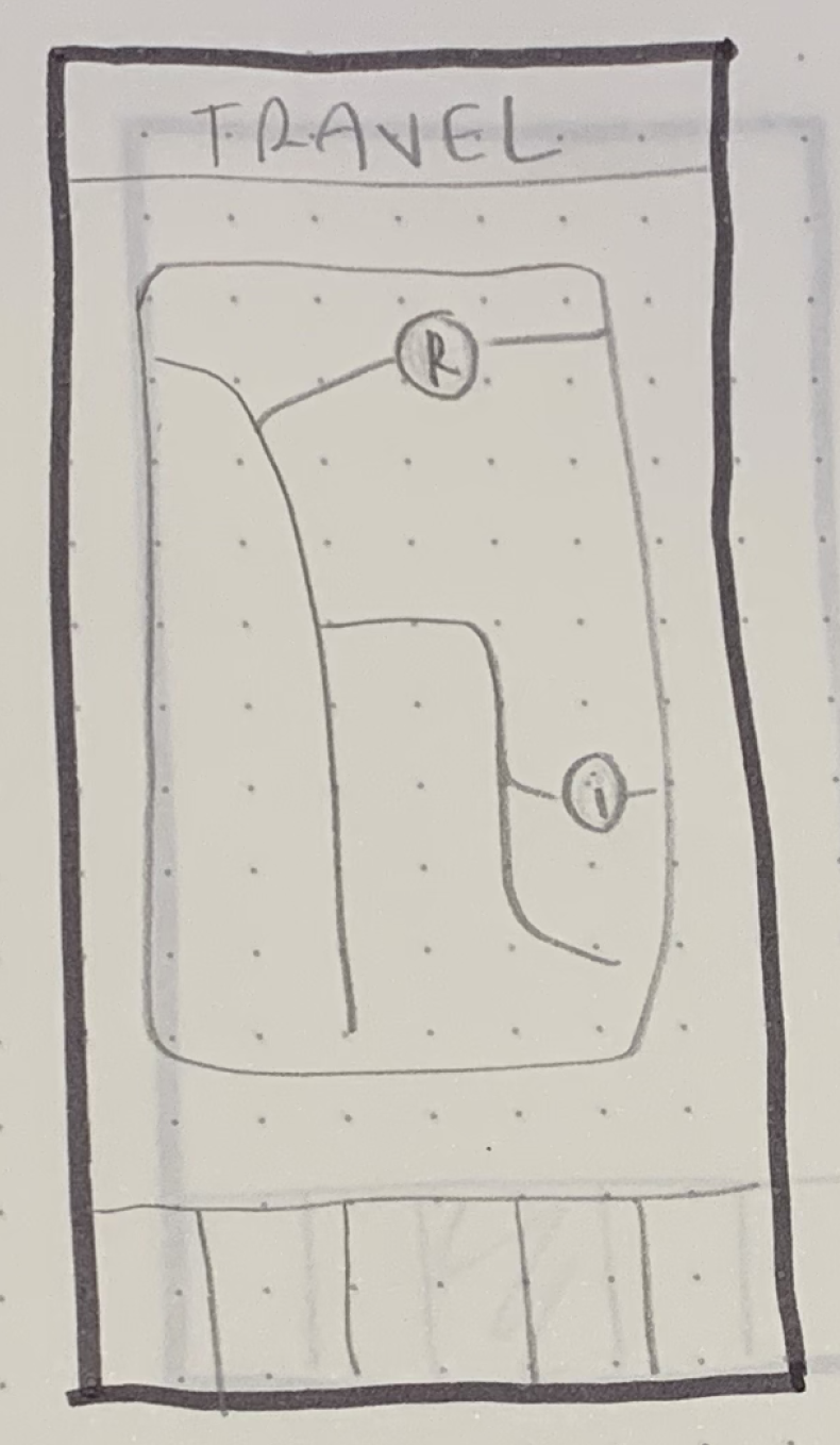
Testing Found: While users were afforded the ability to click on the map for more info there were no clear signifiers that you should click for more info. Additionally, users weren’t clear where they were on the map.
Updates: I added the page with signifiers, explainers, and location filtering on the map view.


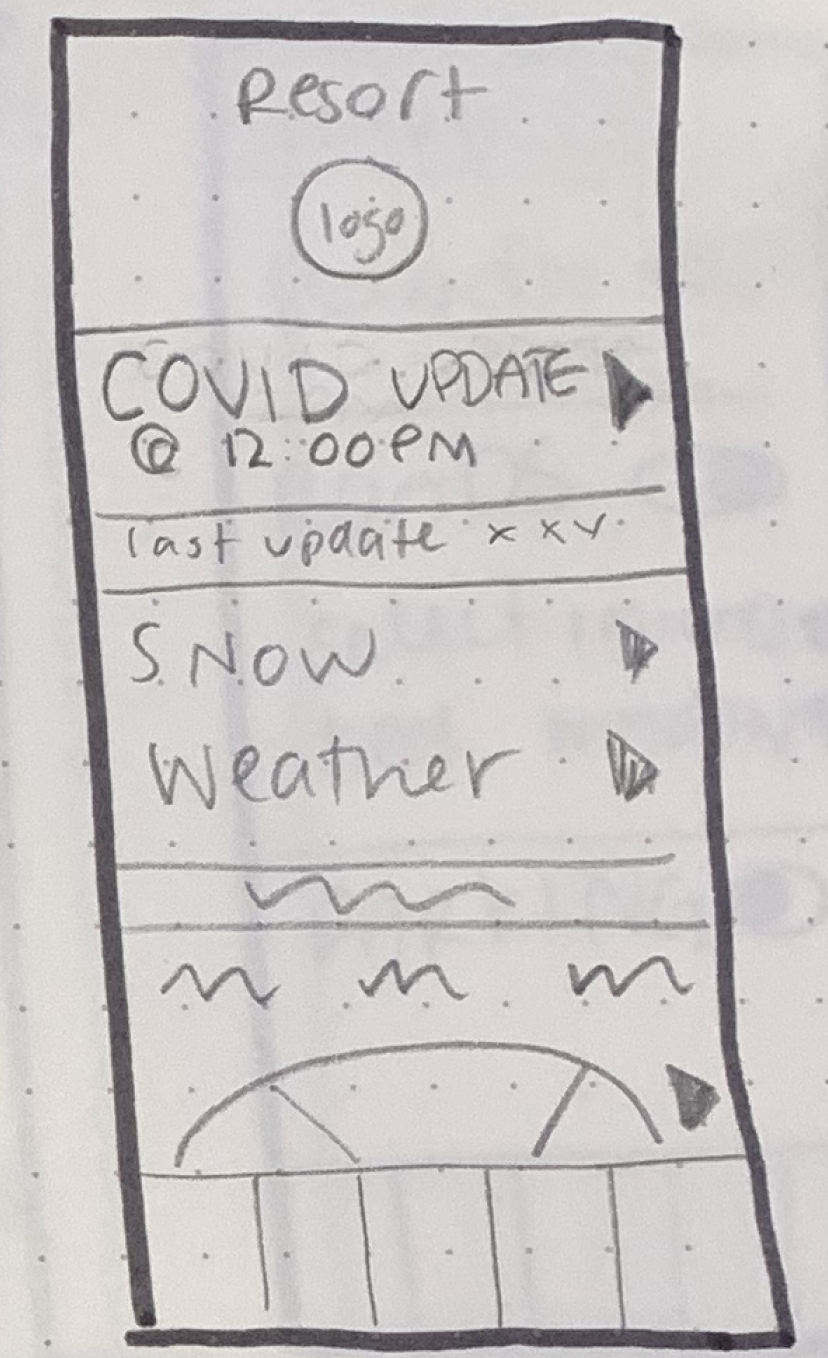
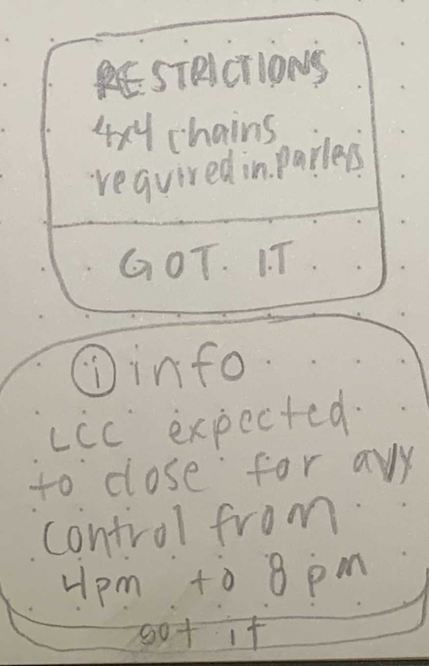
Covid Updates:
Testing Found: The “CU” for Covid Policy Updates at an individual resort was not clear to our users.


Updates: I needed to provide better signifiers to indicate a Covid Policy update and a clearer path to more info. The image was updated to a flag and the text was updated to be clearer. This upgrade also increased understanding for colorblind users with the use of image instead of color to indicate importance.


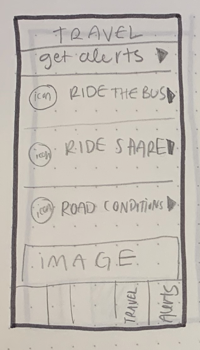
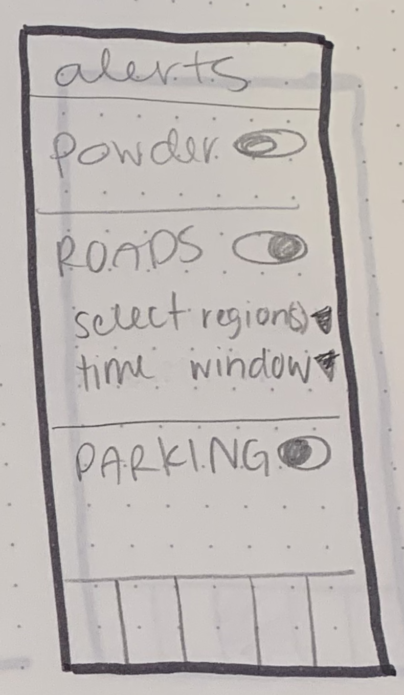
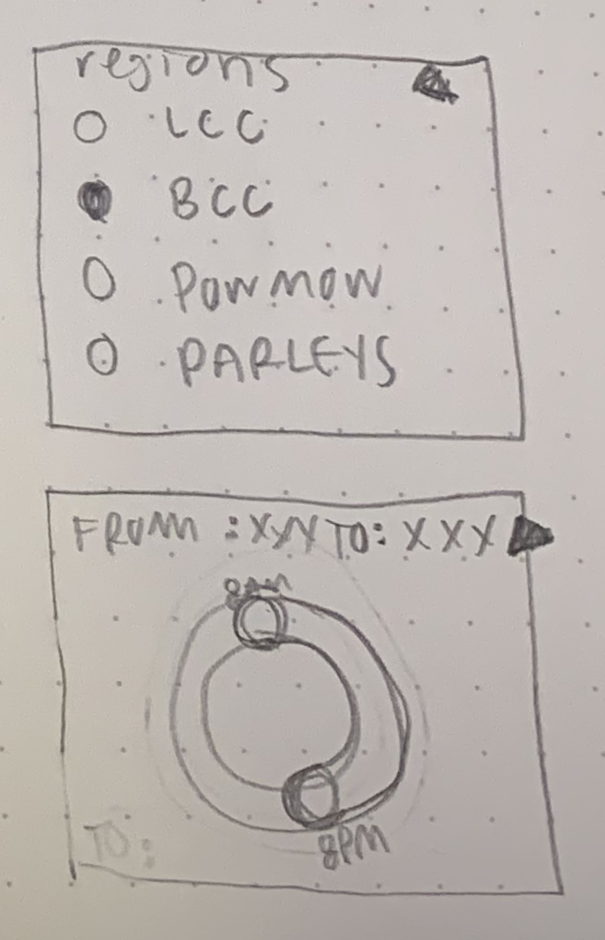
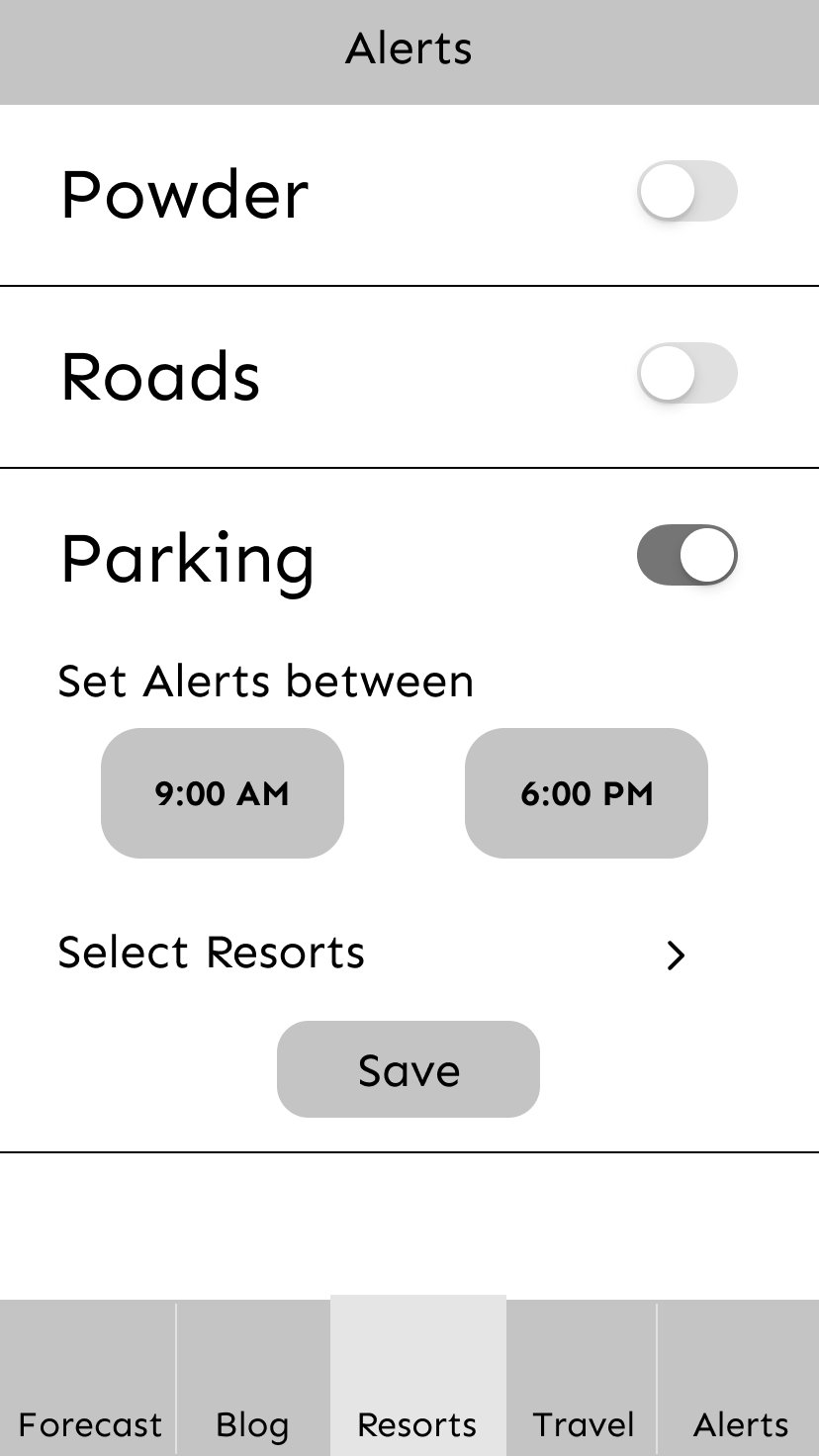
Setting Alerts:
Testing Found: It was clear I provided no signifiers to what users were setting or what conditions they could set.
Testing found: Not all users saved their alerts when they finished setting them and only one user saved the resort the alert should go off for.
Whatever it is, the way you tell your story online can make all the difference.

Updates: Added instructional text for each alert, added arrows indicating a new screen for each setting, and changed the save button to a done button to indicate event completion.


Final Product:
Next Steps
This project dove deep in to user research and testing and less time spent on interaction design. The next step for this project are to design the push alerts that show up on users phones, test how users respond to them, and bring the design up to a higher fidelity with better assets and icons.